PowerPoint is a bit like marmite. While there is a subset of people who enjoy it first thing in the morning, most people would agree that in spite of the colourful features it is, at most, an acquired taste. A recurrent criticism made is that PowerPoint trivialises information and puts medium ahead of content. It is thus not surprising to find a plethora of articles describing how “evil” PowerPoint is and concluding that it has inevitably “consumed the best years of too many young lives”.
The reality in our business is that PowerPoint is a rather unavoidable medium to convey information. PowerPoint has become the standard for information memorandums, credit papers, board presentations, market soundings, pitches, etc. And this is not a bad thing. As a matter of fact, in spite of its bad reputation, academic research shows that PowerPoint is particularly powerful when one considers its capacity to use visual cues as a way to convey complex ideas. In other words, where Power Point excels in its graphs.
Using images and charts as an efficient way to conveying complex ideas is nothing new. However, in a time that is governed by data, misusing this concept is easy and can result in the opposite effect, creating confusion and misleading the reader. Project Finance, a discipline where the robustness and demonstrative value of data is key, is therefore particularly exposed, whether one is talking about pricing for a transaction, energy yields, market forecasts or competition analysis. Fortunately, big advances in the area of cognitive data visualisation research based on neurosciences and psychology are helping understand what makes a good chart. An excellent read on this subject is provided in by Scott Berrinato “Good Charts”, a data visualisation guide published in the Harvard Business Review Press. Some key takeaways from this guide, alongside the personal experience as a PowerPoint user, are summarised below.
-
- Thinking ahead. This piece of advice seems almost trivial, but a common mistake people make when producing graphs is jumping to the PowerPoint board right away. The reality is that different ideas will require different types of graphs. Demonstrating a concept with few data point will not necessarily fit data-driven graphs that seek to delineate trends. For this reason, understanding exactly what the graph is meant to demonstrate, and who the audience of that graph is are key. The best way to do this is often to grab a piece of paper, do some sketching and testing the efficacy of the graph with colleagues before even opening PowerPoint.
- Keeping it simple. Because a graph is used to convey information, a useful graph will have structure, will express the information clearly and will thrive for simplicity. The reason why complex graphs fail, is because they muddy the message and distract the reader making it harder for them to jump to the graph’s conclusions. After all graphs are made to tell a story and persuade. Keeping the message clear and avoiding the multiplication of messages will therefore result in efficient graphs. Clarity and simplicity do not justify lack of aesthetics. Using colours wisely and trying to understand how our eyes see the information and how they move across it, will help create elegant graphs that are memorable and hence will enhance a graph’s impact and efficiency.
- Persuading, not misleading. Good graphs are persuasive and tell a story. For this very same reason, they need to be used responsibly. Choosing a specific axis, limiting outputs to specific periods or undercutting pieces of information through design features can result in providing misleading information. It is therefore important to make sure that whenever a message is given the message remains consistent with the data.
The Harvard Business Review’s guide is a great resource to making better graphs but is not the only one. The democratisation of data visualisation has also come with many useful resources backed by solid research and the realisation that humans are visual animals who constantly seek meaning and make connections. A good graph is ultimately a graph that responds to those instincts.
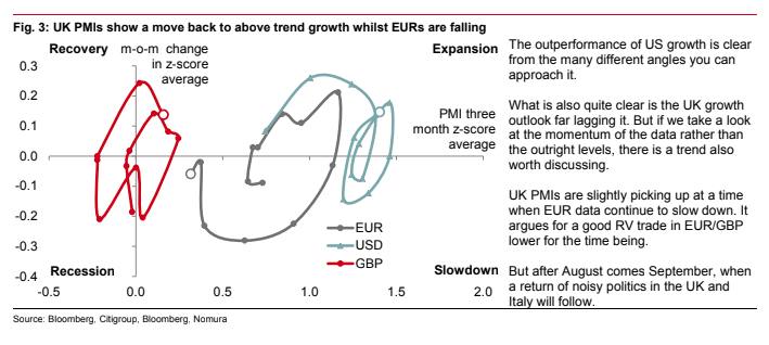
To finish this article, we cannot keep but recommending spending some time in the FT’s Alphaville “Axis of Evil” data-viz catalogue. This blog has some great data-viz examples of terrible graphs, some of which make us wish the authors had chosen a thousand words instead. The graph above caught our attention (link to article), but for all the wrong reasons.
For other great examples visit https://ftalphaville.ft.com/series/Axes%20of%20Evil